This project had cookie-cutter product design requirements you would find in a startup: we have the idea of a product and the vision, we’re working on the tech, but we need someone to design it. By “design” obviously, it was understood that it’s the UX design that was needed.
This is how most design engagements start, especially from founders with no or little experience with tech, and I consider it a part of my job to educate, and teach the founders and the tech staff about the designers’ role in the context of digital products and services.
Luckily for me, both the founder and the CTO of this company were excellent people and serious professionals, and the design and development process which we established was an absolute success and a clear example of a small, highly functional, overachieving team. Just what a startup needs.
Mobile application
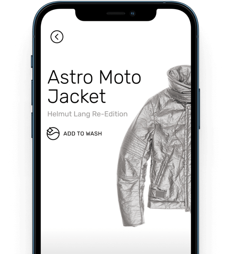
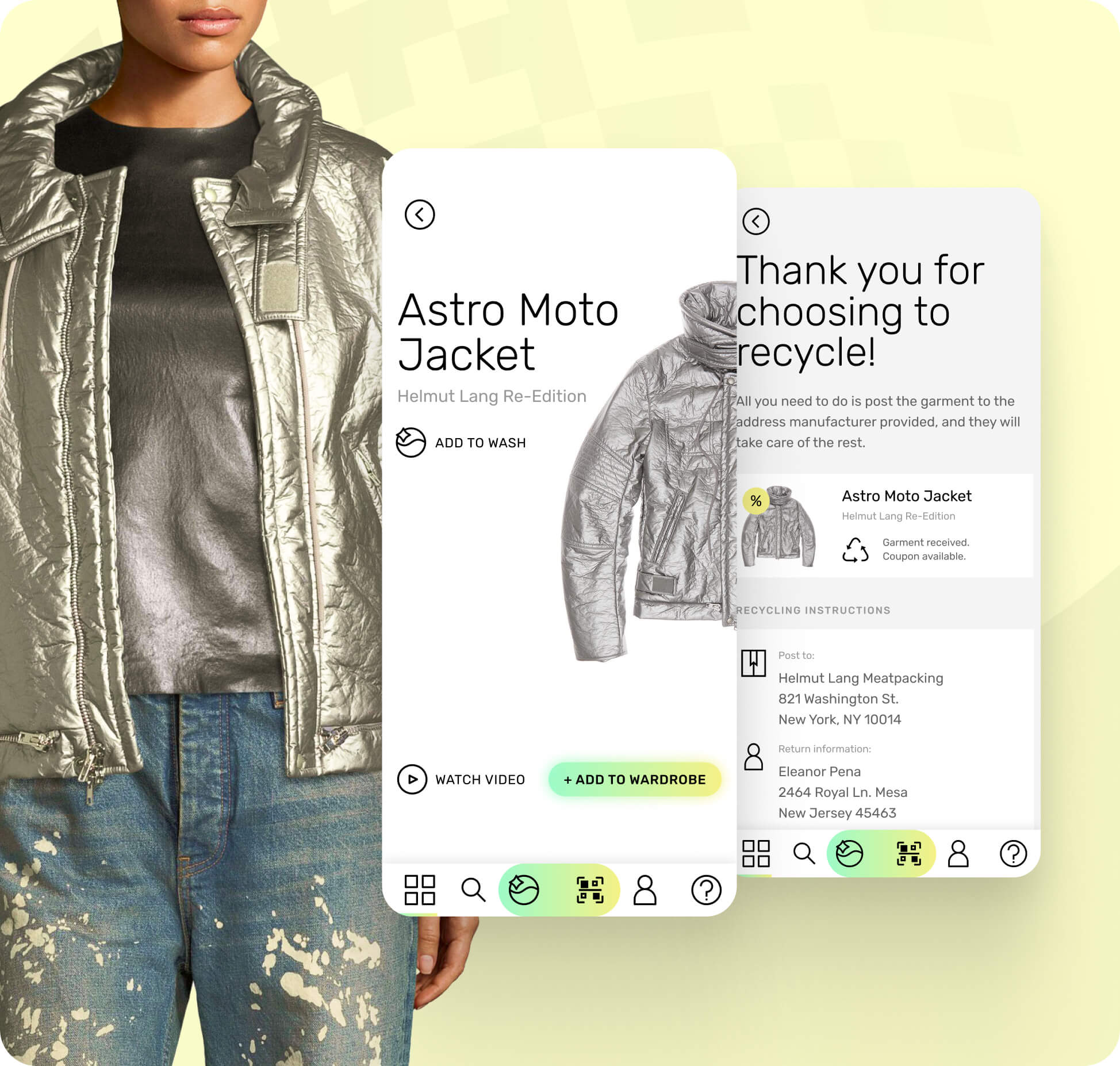
The first order of business was to design for their consumer-facing mobile app. Due to technological constraints we made the decision to go with a universal app which will cover both iOS and Android platforms, based on React Native.
The main challenge was to design the user experience in such a way that it feels “right” on both platforms. This meant that I had to be very mindful of all the behavioral, and UX design specifics of both iOS and Android, as well as the technical limitations. The app needed to remain OS-agnostic, yet not feel too weird on either platform.
In hindsight, this was the right choice considering the budgetary, and capacity constraints, which is something every bootstrapped startup is sensitive to.
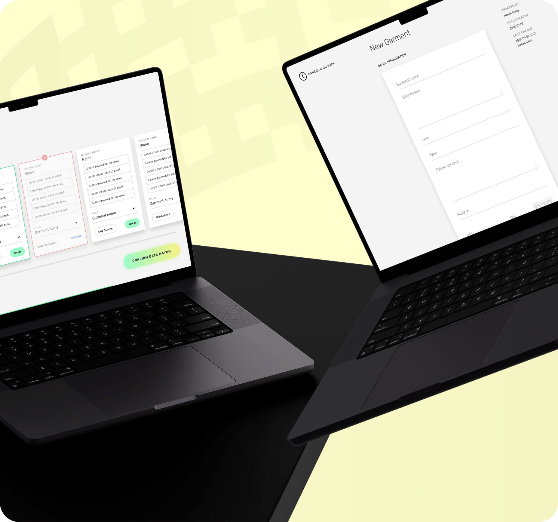
Web application
The web app is a product which was intended to be used by the business customers, and it allows the brands to completely control the digital care content labels of their garments.
As it is often the case, building the product can prove to be the easy part. What we found out was how difficult of a task it will be to change the way an industry like fashion operates, on the inside.
There is very little standardization, and very little process. This in turn made us make many tricky product design related decisions regarding how the users are to perform certain tasks within the app. Juggling between “this is how you must do this” and “here’s a blank slate, do it however you want” is a difficult place to be in.
The design process
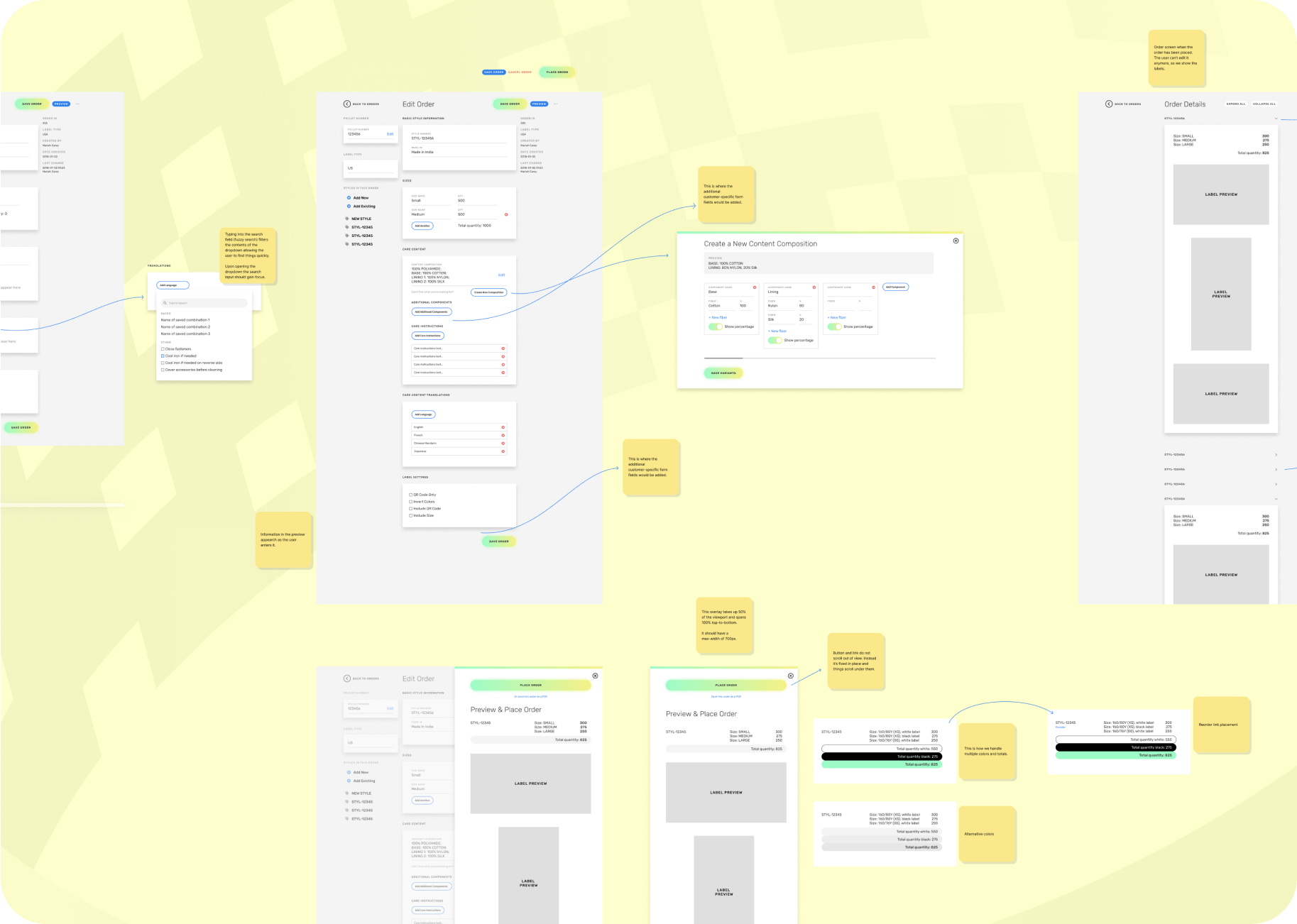
I’m a firm believer of function over form when it comes to mockups, the design process, and designer-developer collaboration.
I’d much rather have a “messy” canvas filled with additional information providing context for the viewer, than look at pristine mockups depicting imaginary scenarios. Even though those have their purpose, it’s not in design and development.
All my mockups are filled with notes and various other documentation assets with the intent to communicate all the details and intricacies of an interface which I believe create a more suitable vibe for the viewers if for nothing more than the sense of unfinishedness.
No one wants to mess up a beautifully set up mockup, but people are surprisingly open to moving things around if they are set up loosely, and this is really important in an inclusive, democratized design process I like to run.