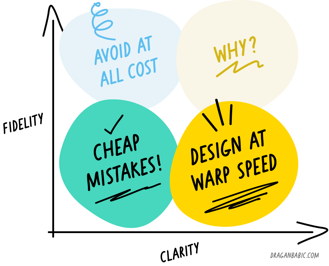
Where clarity is high, fidelity should be low
As an agency owner I do understand the value of high fidelity mockups. You want to make every possible attempt to reduce the amount of ambivalence in the shared understanding of how the end-product is going to look/feel/work like. In a short-term client-vendor relationship they are a valuable asset which saves time. Sure, there is an attached cost, but this cost is money well spent considering the risk it mitigates. This is especially true when the end-product is a marketing asset.
What I could never get fully behind is creating hi-fi mockups when you're a part of an in-house team working on a digital product. In my mind, these teams of designers and developers should be so tightly-knit that hi-fi mockups aren't necessary at all. The only exceptions would be when the product doesn't exist yet, or you're working on something fundamentally different/new so it makes sense to mock these things up as a part of an exploration effort.
In-house teams should have various assets and reference points at their disposal—design systems, existing product, branding, etc—as to how the product's interface and UX should be, that it's a waste of time delivering high fidelity mockups as part of a regular product design and development process.
What I'm trying to say is that I think that designers should produce the bare minimum in terms of assets—in terms of quality, not number!—in order to communicate the changes or new features to the rest of the team as clearly as possible. The “design” should be finished in the code itself, in the context of the functional product.
The aforementioned “bare minimum” ranges from textual descriptions, rough sketches, low fidelity designs, and even high fidelity comps only where required.
This is something I feel teams with existing products are in the position to do, and this can be their competitive advantage.
Make sure to check out the discussion on LinkedIn, where Strahinja added some excellent additional insight.
What's this?
You are reading his blog.